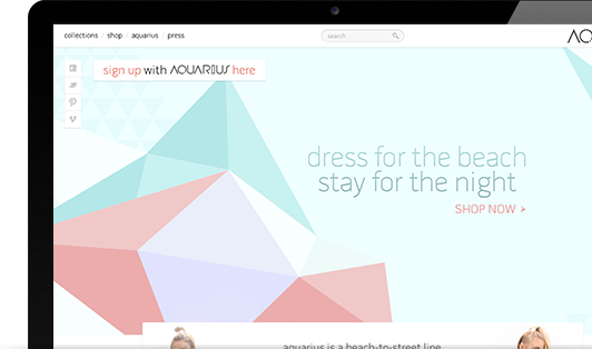
Aquarius is a beach-to-street line which has a fresh take on traditional beachwear. It consists of casual separates and dresses in vibrant colors, edgy silhouettes and look-at-me styles. AQUARIUS is based in Miami Beach and made in New York, combining an eclectic vibe that embodies downtown style and beach culture.

Logo and Brand Development
We designed the entire Aquarius digital Identity from the ground up. We started with the logo design and its funky unique style. It was a creative process where we worked closely with the client to capture her vision of the brand, point of connection with her target audience, and her long-term expectation for growth.
Custom Product Interaction
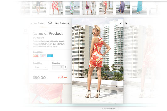
Browsing from one product to the next is seamless. The user can go to the next product in the category or switch categories all from the same navigation cluster. The navigation is in the hands of the user. This strengthens the sense of discovery users feel when browsing. Users are more likely to share what they’ve found if they feel they discovered it on their own.
Custom Cart and Wish List Preview Sliders
Custom widgets for shopping cart and wish list allow users to have an engaging shopping process that keeps them interested in exploring the site and its products. By integrating widgets that let the user make more of their own choices, they are more likely to bookmark, share, and return to the site. Netro’s design allows the user to be in control. This makes the site’s connections with customers deeper than those of competitors.

Responsive Design
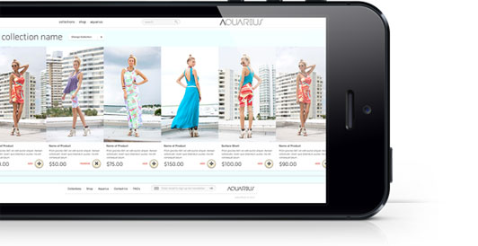
The site is fully mobile friendly and is designed to appeal to specific customer touch points. The idea was to give users the feeling of a printed magazine rather than the boring and static ecommerce pages most people are used to. The target audience is a young fashion-forward group of people, and keeping them interested is a challenge. So Netro designed a catalog to quickly switch between collections and indulge the senses using large images. Depending on screen resolution the user can see three or more products, all with high quality fashion photography.
The catalog product pages integrate key information such as pricing, size, quantity and color in a way that feels natural to the image. The user can choose different values for each point of information and easily navigate to other products to compare. This gives the user the feeling of discovery rather than being fed a static page.
